 Facebook announced a few weeks back that their newsfeed has been given a revamp, (you should see yours changing as they roll it out over the next few weeks), and you may also have recently heard of the introduction of “Graph / Social Search”, which is in beta test at the minute (basically meaning that Facebook will soon be moving into providing a search facility).
“So what?” you may think.
Well, I’ve delivered quite a few training sessions on how to use Facebook in business, and one of the things that still surprises me is how much confusion there still is on how to use it properly for business. So I thought this may be a good opportunity to outline a few tweaks you could make now (they’re good practice anyway), which will help your page when the changes happen.
Here’s 5 simple tips which I hope will help:
1. Keep it visual – Make sure you have a good profile and cover photo (Your cover photo is your biggest branding opportunity – use it well!). Below is the Facebook cover image from WhatsOnNI.com, a site run by a friend of mine, Jacqueline McGonigle. This is an example of a good cover image – professional, features the brand, and you just take one look at the cover image and you know exactly what the site is about.  This image will become even more important in the new news feed, as when someone likes your page, it’s your cover photo, and not your profile pic that will appear in their timeline, so make it a good one.
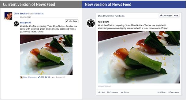
2. Facebook say of the redesign: “You’ll still see all the stories you saw in your News Feed before, but with a fresh new look: photos, news articles, maps, and events all stand out even more”. So the new look news feed will display photos and videos larger, so if you don’t do it already, use photos & videos more in your posts – they’ll stand out even more, and they’re proven to increase engagement with your users
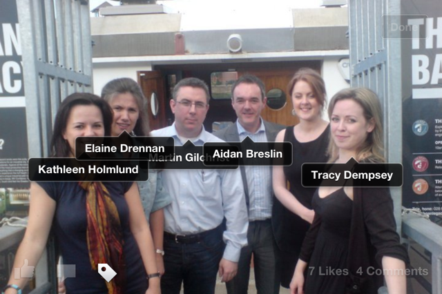
 3. Tag people in your photos and videos – OK this isn’t directly related to the incoming changes, but it’s still good practice, and a really good way to have your photos shared / appear on more timelines, and get the most out of each photo. If you’re not connected to some people in the photo, then ask the ones you are connected with to tag their friends.
4. Make sure your “About” section is fully completed – Name, Category, Web Address, Location (as precise as you can, which incidentally will also mean you’re more likely to show up under the “Nearby” facility on mobile devices).
You should also complete the Description section, and use keywords. For example, don’t just enter “Printing and Stationery” – what do you actually do? Graphic Design? Litho Printing? Business Cards? Banners? Put them all in there. You could also think of including a call to action, to get those interested enough to do a little bit more than just “Like” your page (visit your site / sign up to your newsletter / download your free app / etc).
The new design is intended to be more mobile-focused and give a similar look and feel between desktop and mobile. The “About” section will become much more important when Facebook’s new Graph Search is fully rolled out, and people start searching Facebook for “hairdressers in Belfast”, “printers in Dublin”, “show me who does laser hair removal in Derry”, etc
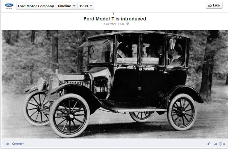
5. Use milestones The date you opened your business / the date you moved to bigger premises / when got your premises renovated / when you added a new printing machine (if you’re a printing business, that is!) – hopefully you get the idea. This was introduced last year, and it’s a quite often forgotten opportunity to tell part of your business story. By the way these milestones don’t have to be the ones since you joined Facebook – you can backdate (see example milestone below from Ford’s Facebook page in 1908 – which I think may have been even before Facebook was introduced! 😉

And don’t forget that photo or video to make the milestone stand out more
Hope that helps – as usual, any questions just comment below
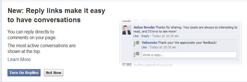
 Facebook today roll out more changes for Pages & brands, with an option to opt in to a feature which will hopefully make it easier to have conversations on your page – their new Replies feature.